Wendy MacNaughton’s annual 30 days of drawing introduced me to Corita Kent.
I was admiring this creativity manifesto Corita had created when I wondered: how was it made?
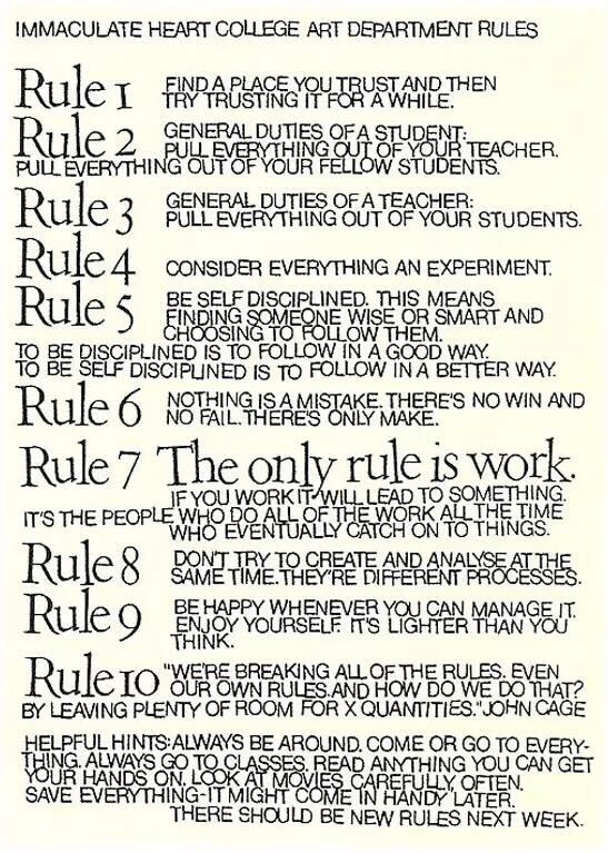
The kerning and type is so peculiar. And I knew it was from the 60s (1965 to be exact) so obviously it wasn’t as easy as it is nowadays to adjust a font and print. So how would this have been made?
That led me to learning how Corita Kent used silk screen printing. I found a video here:
I then tried my best to find how typesetting was even done on silk screens, specifically in the 60s.
According to ChatGPT, (so… citation needed) people would basically create something like the manifesto by using transfers of individual letters, basically sticking them exactly where they wanted them, then take a photo of the finished combination, and then create a stencil from that photo for the silk screen. The ALTERNATIVE was tracing every letter and cutting the letters out of wax paper to act as the resist. Whew what effort!